
Streamlining Job Applications: UX Research for Robert Half
Robert Half, a global leader in staffing and consulting services, is dedicated to connecting businesses with skilled professionals. This project marked the company’s first-ever benchmarking process to improve the user experience of its online job application system. With an increasing number of job seekers using the platform, the existing process led to user frustration and inefficiencies. We aimed to identify key pain points and establish benchmarks to create a more intuitive, streamlined application experience that better serves users.
The Team
Jabari Cooke(UX Research Intern)
Sabrina Bhangal(UX Researcher)
Christina Wong(Senior UX Researcher)
My Role
As a UX Research Intern, I refined test questions, reviewed unmoderated tests, calculated key metrics, and turned data into actionable insights that shaped product decisions. I also led Robert Half's first benchmarking process, using test results to set performance standards and improve the user experience.
Research Goals
Project goal: Measure task effectiveness and efficiency for job seekers using the Robert Half website.
Objective: Identify specific pain points in the user experience.
Benchmarking: Compare the current user experience against competitors.
Outcome: Improve the job application process to make it more seamless and user-friendly.
Research Methodology
We used unmoderated usability testing via UserZoom Go, which enabled us to test a larger, geographically diverse participant pool quickly. This approach ensured we completed testing before the website updates were implemented. Alongside screen access and verbal feedback, participants also provided written feedback and completed mini-surveys through Qualtrics to help us better gauge their interactions and overall experience.
The study involved 30 job seekers completing three core tasks. We measured task success rates, time on task, and error rates. Quantitative metrics like the System Usability Scale (SUS) and Net Promoter Score (NPS) were combined with qualitative insights from participants to provide a comprehensive view of the user experience.
Recruitment Criteria and Process
Pre Screening process:

We recruited participants who were actively seeking employment and had previous experience using online job boards. Participants were also incentivized to take part in the study, helping us gather diverse insights from various regions and job industries.
Participant Demographics:

Usability tasks
Participants were asked to complete three core tasks:
Search for a job
Apply for a job
Create an account
*Since the testing was unmoderated, our questions were structured as guiding statements to remind users to think out loud and reflect on their actions as they completed the tasks.
Analysis and Synthesis Process
For the qualitative data, we used Miro within group meetings to group insights from the extensive feedback notes, allowing us to identify common themes and patterns in user behavior.
For the quantitative data, we calculated averages for key metrics, such as task completion times and success rates, to assess overall user performance and pinpoint areas for improvement.
Results(per Usability Task)
In this section, you’ll see the key outputs from our usability testing, which are broken down into three parts:
Task Performance Analysis:
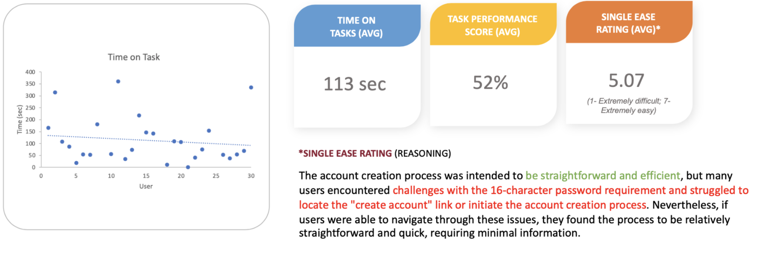
This part showcases how users performed in the primary task of searching for a job. You’ll see a scatter plot representing the time each user spent completing the task versus the number of users. Alongside the plot, we present the average time on task, task performance score, and the single ease rating. These metrics help highlight overall task efficiency, how easily users completed the task, and the perceived difficulty from their perspective.Error Tracking:
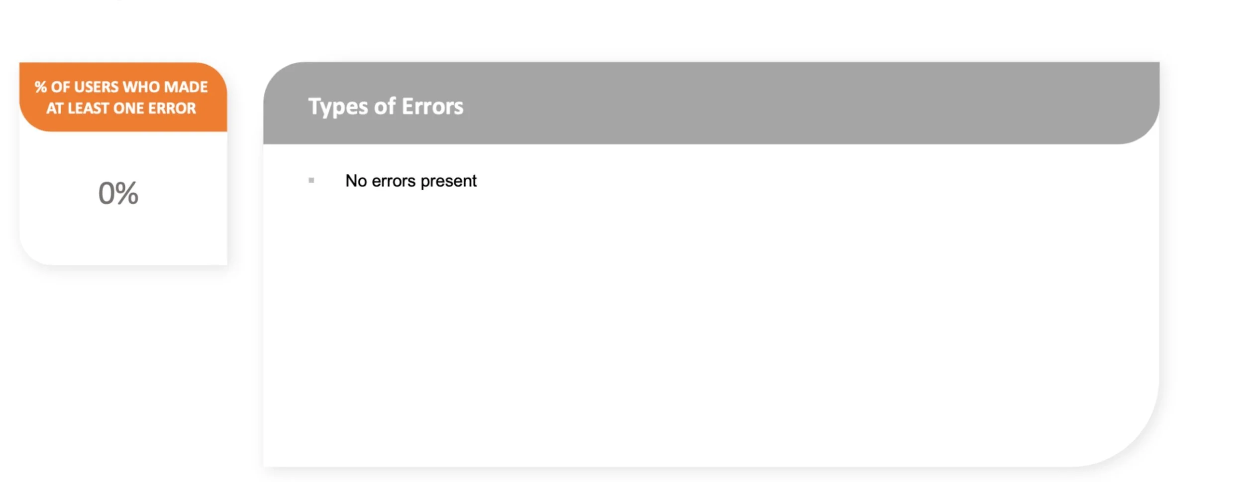
Next, you’ll find an analysis of user errors. Here, we present the percentage of users who encountered errors while performing the task. If errors occurred, a breakdown of the types of errors would also be shown. This data offers insight into the clarity of the interface and the users' understanding of the process.Challenges and Pain Points:
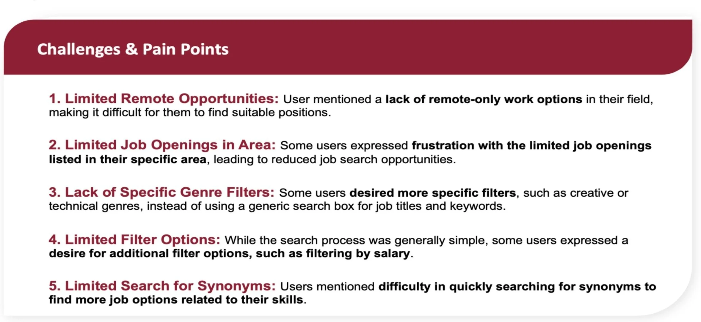
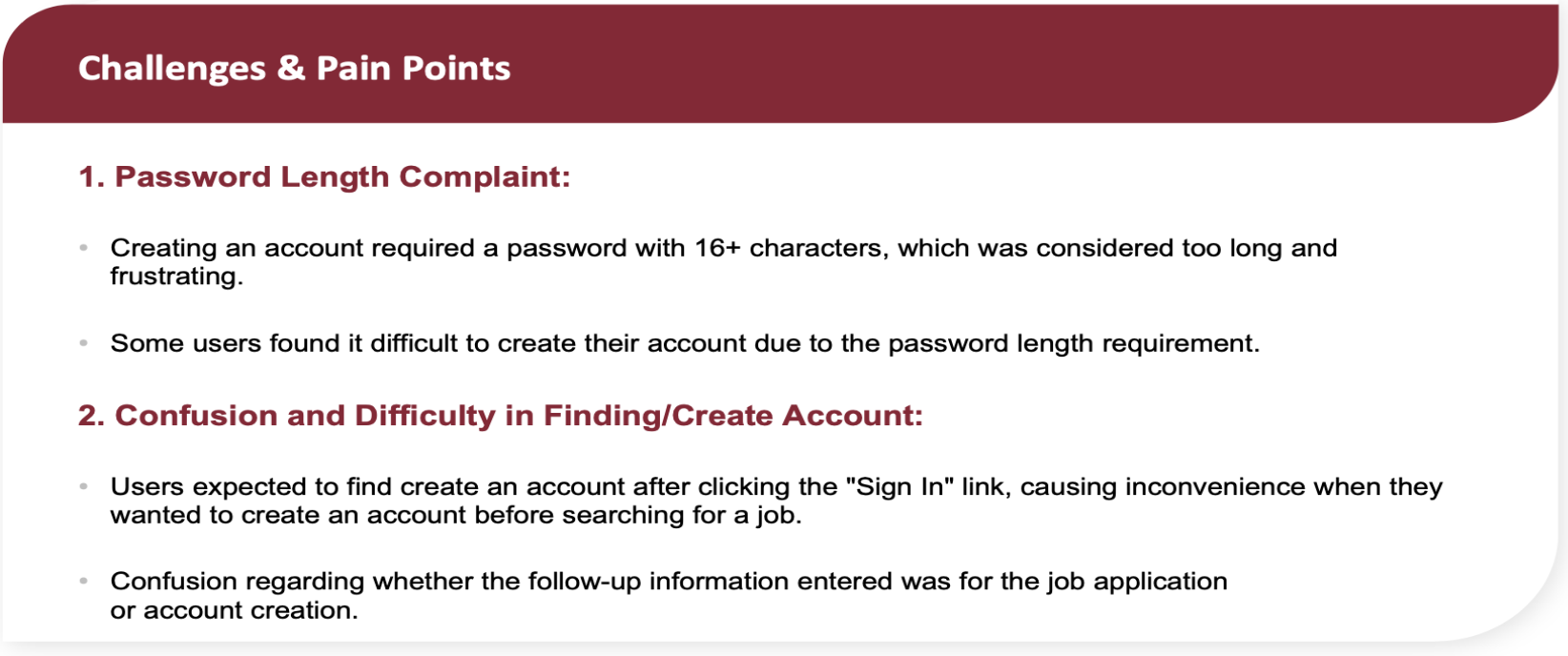
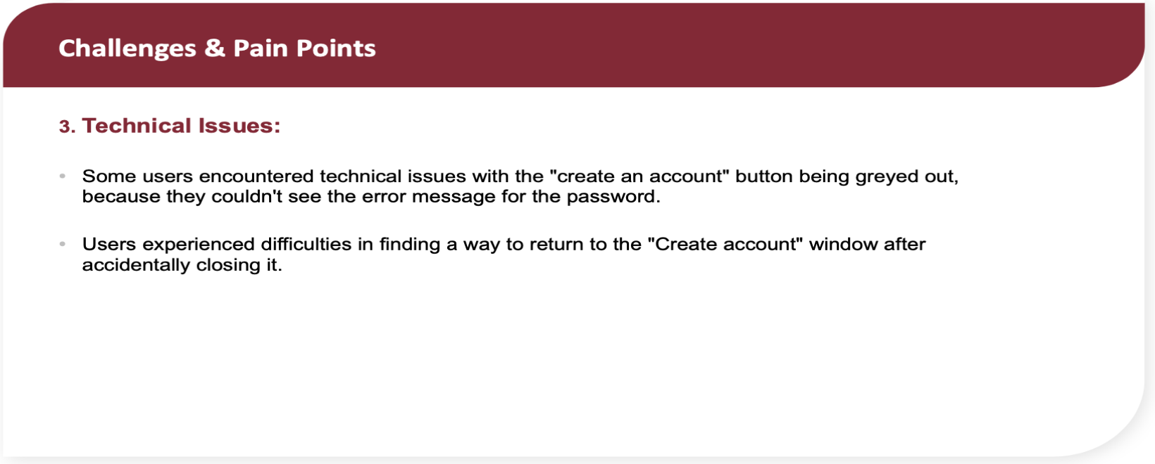
Finally, we outline the qualitative feedback from users in the form of challenges and pain points they encountered. This section lists common issues, such as limitations in job search filters, difficulty in finding remote work options, and the absence of genre-specific job categories. These insights are critical for identifying areas of improvement and enhancing user satisfaction in future iterations.
Task 1(Find a job):

Task 2(Apply to a job):


Task 3(Create an account):


Results(Product Score Card)
Usability Score (SUS: 81)
How it’s calculated: Users rate the product’s ease of use via a 10-question survey. The responses are converted to a score out of 100. A score of 81 indicates strong usability, above average.
Task Performance
Task 1: 100%, Task 2: 92%, Task 3: 52%
How it’s calculated: Task performance is tracked by success rates and errors. A 100% score means all users completed the task without errors, while lower scores like 52% indicate more errors and challenges.
Product Loyalty (NPS: 5)
How it’s calculated: Users rate how likely they are to recommend the product on a scale from 0-10. The percentage of promoters (9-10) minus detractors (0-6) gives the NPS score. A score of 5 means "Good" but could improve.
Emotional Sentiment (Score: 17)
How it’s calculated: User feelings are collected through feedback and scored. A score of 17 reflects mostly positive sentiments, with some users noting issues like feeling the product was "Busy" or "Complicated."

High-Level Recommendations
High Priority
Enhance the password creation experience: Provide more informative error messages that inform the user what requirements are missing and how to recover from the error. For example, your password is 14 characters long and needs to be 16. If possible, integrate with strong password generators or allow login with different methods, such as your LinkedIn or Google account. [Task 3—Create an account].
Account creation as part of the sign-in experience: To improve user experience and adhere to platform and industry conventions. Consider allowing users to create an account as part of the sign-in experience to enhance user familiarity and ease of access. [Task 3 - Create an account]
Consider different ways to attract attention to the sponsorship question. For example, Separate the sponsorship question from the other checkboxes or change the checkboxes to toggle switches. To ensure users pay attention and respond correctly to the sponsorship inquiry, provide a visual treatment that distinguishes it from the other agreements. [Task 3 - Create an account]
Medium Priority
Establish a clear divide between applying for a job and creating an account: To alleviate user uncertainty, establish a clear divide or break to inform them that the follow-up questions after they apply are separate from the job application process. [Between Task 2 & 3 — Apply for a job & Create an account]
Indicate mandatory and optional fields: Prevent future errors and ensure a user-friendly experience by clearly indicating mandatory and optional fields in the forms across the site. [Across all forms on the RH website]
Impacts
Enhanced User Onboarding: Improved password creation and account setup processes, reducing user drop-off and increasing successful sign-ins.
Higher User Satisfaction: Clearer error messaging and streamlined interactions, leading to a smoother job application experience and reducing frustration.
Increased Engagement: Better attention to key questions, like the sponsorship question, encourages more accurate responses and helps users progress through the application.
Operational Efficiency: Provided actionable insights through scorecards and usability testing, enabling iterative platform improvements based on real user behavior.
My Learnings & Achievements
UX Contribution to Development Team: Identified and highlighted a critical usability issue in the job application process. My keen observation led to the discovery that users could not submit .docx files, directly impacting their experience and the system's effectiveness.
Skill Enhancement in UX Tools and Methods: Enhanced my UXR expertise by acquiring practical UserZoomGo skills and conducting unmoderated usability tests. This experience broadened my understanding of UXR principles and techniques.
Advancement in UX Presentation Skills: Recognized for my contribution during my internship, I was invited back to present my UX findings to a larger audience within the company. This opportunity not only underscored the value of my work but also allowed me to refine and demonstrate my ability to communicate UX concepts effectively.